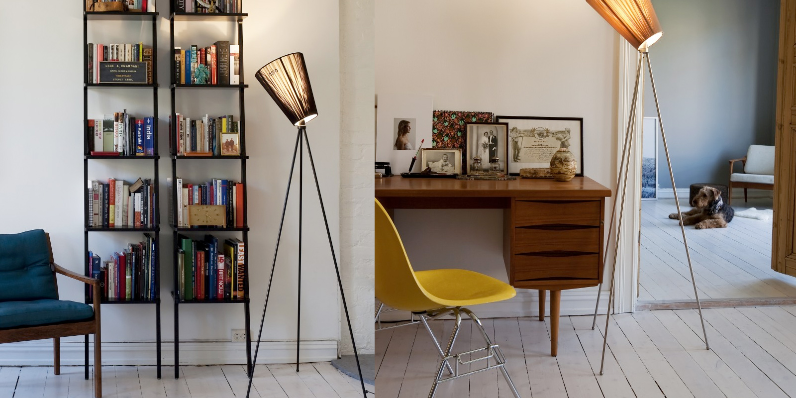
A balanced composition feels right. It feels stable and aesthetically pleasing. While some of its elements might be focal points and attract your eye, no one area of the composition draws your eye so much that you can’t see the other areas.
Balancing a composition involves arranging both positive elements and negative space in such a way that no one area of the design overpowers other areas. Everything works together and fits together in a seamless whole. The individual parts contribute to their sum but don’t try to become the sum.
An unbalanced composition can lead to tension. When a design is unbalanced, the individual elements dominate the whole and the composition becomes less than the sum of its parts. In some projects, unbalanced might be right for the message you’re trying to communicate, but generally you want balanced compositions.
Note: This is the seventh and final post in a series on design principles. You can find the first six posts here:
Physical And Visual Balance
Balance is easy to understand in the physical world, because we experience it all the time. When something is unbalanced, it tends to fall over. You’ve probably been on a seesaw or a teeter-totter at some time in your life — you on one side and a friend on the other.
Assuming you were both about the same size, you were able to easily balance on the seesaw. The following image appears to be in balance, with two equally sized people equally distant from the fulcrum on which the seesaw balances.
The person on the left makes the seesaw rotate counterclockwise, and the person on the right makes it rotate clockwise by an equal amount. The force of each person acts in a different direction, and their sum is zero.
If one of the people was much bigger, though, the balance would be thrown off.
Here, the force of the larger person is reduced by being closer to the fulcrum on which the seesaw balances. I’ll trust you’ve been on a seesaw before or at least watched others play on one and that you have a pretty good sense of what’s going on.
Visual balance is similar. Physical weight is replaced by visual weight. The direction in which the physical weight acts is replaced by visual direction.
As a reminder, below are definitions for visual weight and visual direction, although I’ll refer you back to the fourth post in this series for more details.
- visual weight
This is the perceived weight of a visual element. It’s a measure of how much anything on the page attracts the eye of the viewer. - visual direction
This is the perceived direction of a visual force. It’s the direction in which we think an element should be moving if it were given a chance to move according to the forces acting on it.
You don’t use instruments to measure the forces. You don’t use formulas to calculate whether everything is in balance. Rather, you use your eye to determine whether a composition is balanced.
Why Visual Balance Is Important
Just as in the physical world, visual balance is a good thing. It’s desirable in and of itself. An unbalanced composition can feel uncomfortable for the viewer. Look back at the second of the three seesaw images — it looks wrong because we can tell that the seesaw shouldn’t be in balance.
Visual weight is a measure of the visual interest of an element or area in a design. When a composition is visually balanced, every part of it holds some interest. The visual interest is balanced, which keeps viewers engaged with the design.
Without visual balance, viewers might not see all areas of the design. They probably won’t spend any time in areas with less visual weight or interest. Any information in those areas could easily go unnoticed.
You would balance a design visually because you want to balance the points of interest in your composition, so that viewers spend time with all of the information you want to convey.

Nice post!
Thanks so much!
Great Article, now days eCommerce website peoples have high majority use and online shopping is very popular in use to eCommerce website.but “Discover Website Design” they give to high success those eCommerce site…