They were both Chinese immigrants to America—my father was a mechanic and my mother took care of the family. They taught me to work hard, take opportunities, accept responsibility and eschew cowardice, less by explicit direction and more by implicit influenc
Balancing a composition involves arranging both positive elements and negative space in such a way that no one area of the design overpowers other areas. Everything works together and fits together in a seamless whole. The individual parts contribute to their sum but don’t try to become the sum. An unbalanced composition can lead to tension. When a design is unbalanced, the individual elements dominate the whole and the composition becomes less than the sum of its parts. In some projects, unbalanced might be right for the message you’re trying to communicate, but generally you want balanced compositions.
Happiness is not a matter of intensity but of balance, order, rhythm and harmony.
– Thomas Merton
Physical And Visual Balance
Balance is easy to understand in the physical world, because we experience it all the time. When something is unbalanced, it tends to fall over. You’ve probably been on a seesaw or a teeter-totter at some time in your life — you on one side and a friend on the other. Assuming you were both about the same size, you were able to easily balance on the seesaw. The following image appears to be in balance, with two equally sized people equally distant from the fulcrum on which the seesaw balances.
The person on the left makes the If one of the people was much bigger, though, the balance would be thrown off.seesaw rotate counterclockwise, and the person on the right makes it rotate clockwise by an equal amount. The force of each person acts in a different direction, and their sum is zero.
Just as in the physical world, visual balance is a good thing. It’s desirable in and of itself. An unbalanced composition can feel uncomfortable for the viewer. Look back at the second of the three seesaw images — it looks wrong because we can tell that the seesaw shouldn’t be in balance. Visual weight is a measure of the visual interest of an element or area in a design. When a composition is visually balanced, every part of it holds some interest. The visual interest is balanced, which keeps viewers engaged with the design. Without visual balance, viewers might not see all areas of the design. They probably won’t spend any time in areas with less visual weight or interest. Any information in those areas could easily go unnoticed. You would balance a design visually because you want to balance the points of interest in your composition, so that viewers spend time with all of the information you want to convey.
Balancing a composition involves arranging both positive elements and negative space in such a way that no one area of the design overpowers other areas. Everything works together and fits together in a seamless whole. The individual parts contribute to their sum but don’t try to become the sum. Balance is easy to understand in the physical world, because we experience it all the time. When something is unbalanced, it tends to fall over. You’ve probably been on a seesaw or a teeter-totter at some time in your life — you on one side and a friend on the other.


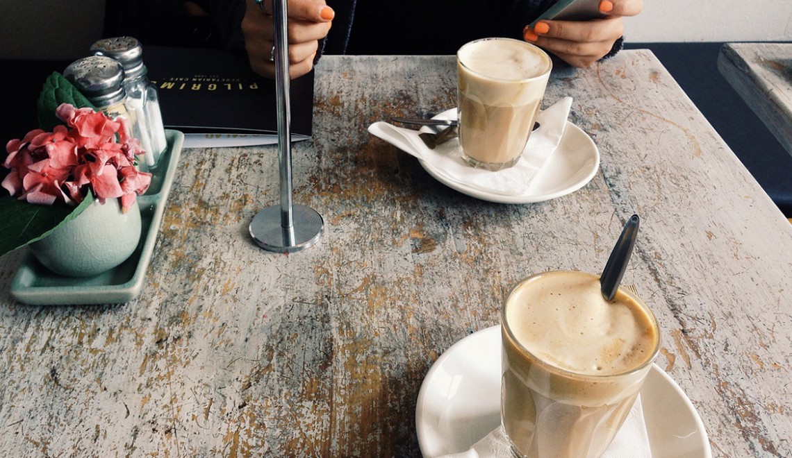
Want to taste it!